Today, we’ll face the scales component of ggplot2, looking at some of its (infinite) features with quick examples.
The first question that may come to mind is “what does scales do?”, followed by “when should I use it?”. We reply to the first question, leaving this entire post as an answer to the second one: scales defines how the mapping in aes () should take place. It follows that each mapping has its associated scales by default, and that we can modify it by adding the component to the ggplot function.
Command
The scales command is scale_<aesthetic>_<type>().
There are two parts that can change every time: aesthetic refers to the component to be modified (color, x-axis, y-axis, …), while type can be either generic (continuous, discrete, binned) or specific (area, identity, …).
Modify the aesthetic of the axes
The first application that comes to mind when thinking about scales is the modification of the aesthetics of the axes; in fact, the axes can be modified in many ways. Let’s immediately see an example of how some parameters can be changed.
ggplot(mpg) +
  geom_point(aes(x = displ, y = hwy)) +
  scale_y_continuous(trans = "log10") +
  scale_x_continuous(name = "engine displacement (l)", breaks = c(2.5, 4, 5.5))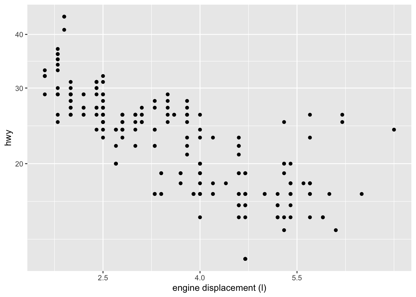
Figure 1: Graph in which the aesthetics of the axes have been modified
As you can see, I added two commands, one for each axis, giving the inputs of interest in a very intuitive way. There would be many other options for each axis, I invite you to look at them for yourself and try some.
Change the scale of the point size in a scatter plot
I bring this example to you as it is very self-explanatory and useful. Normally, if you want to use a discrete numeric variable to set the size of the points, the resulting graph is the following: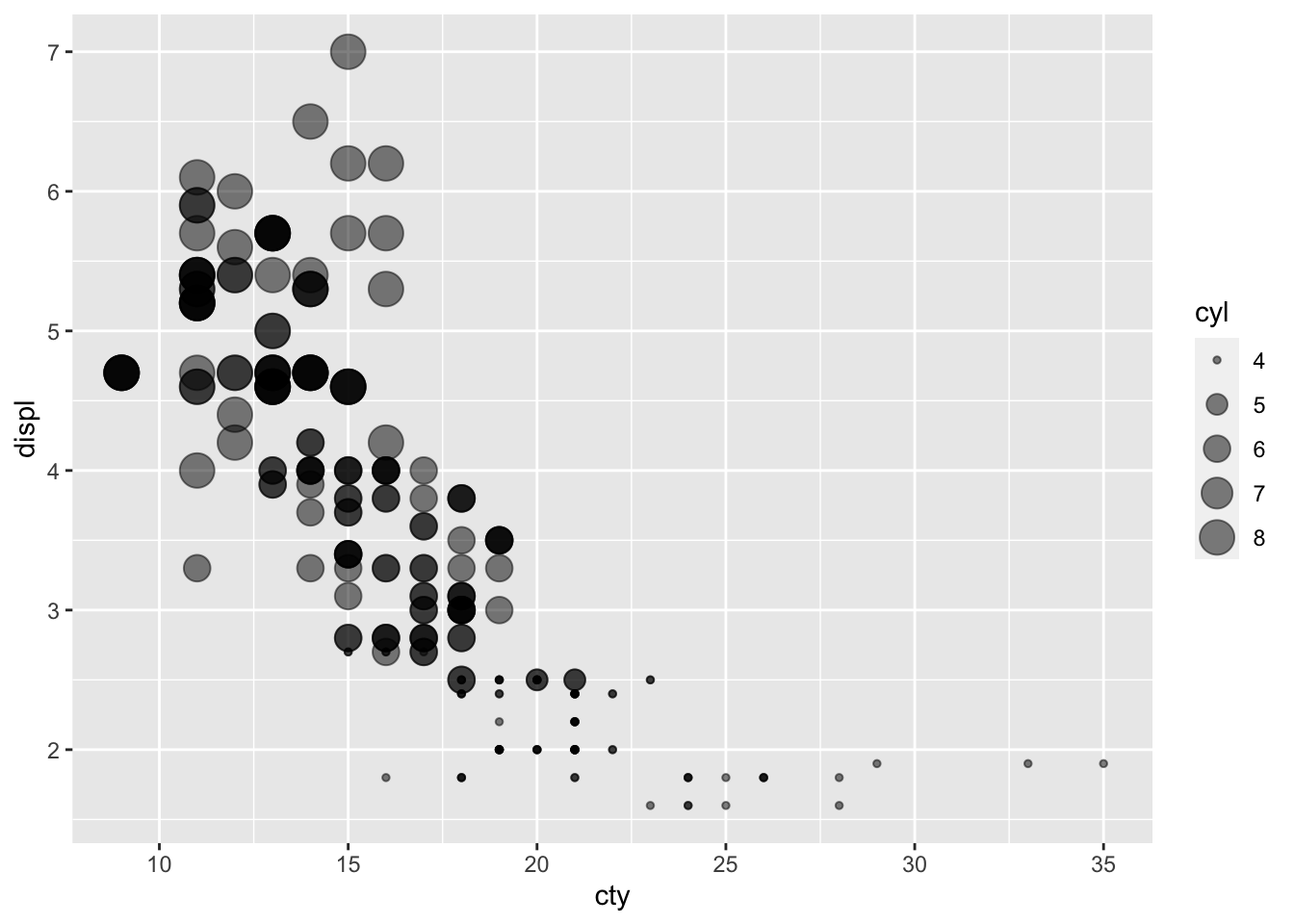
Figure 2: Basic scatter plot with point sizes based on a discrete numeric variable
The problem is that there is no direct correspondence in the size of the points, much more in the size of the rays of the points, which produces a distorted perception in our mind, since we are not able to perceive a linear correspondence between the rays as much as more for areas. In this case, since the area increases exponentially as the radius increases, there is the risk of overestimating the difference.
For this reason, you can modify the code by adding scale_size_binned(breaks = c (4, 5, 6, 8)): size refers to the aesthetics to be modified and breaks indicates which values to mark on the legend. This is the result:
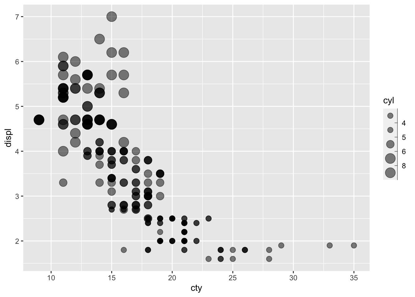
Figure 3: Scatter plot where the dot size has been changed with scale
The points have a more consistent difference with the perception we have.
Changes graph colors
Let’s go to another macro-area for editing the mapping, that is the color component.
First, you need to decide which palette to use. There are many online, but for an immediate feedback you can use the RColorBrewer::display.brewer.all () command, thanks to which we can see them in the Viewer section.
I have chosen to use Pastel1.
At this point, after having entered the command to set the color according to the class in the correct place (refer to the post Introduction to GGPLOT2), I add the one to change the scale_colour_brewer(palette ="Pastel1", name ="CLASS") palette.
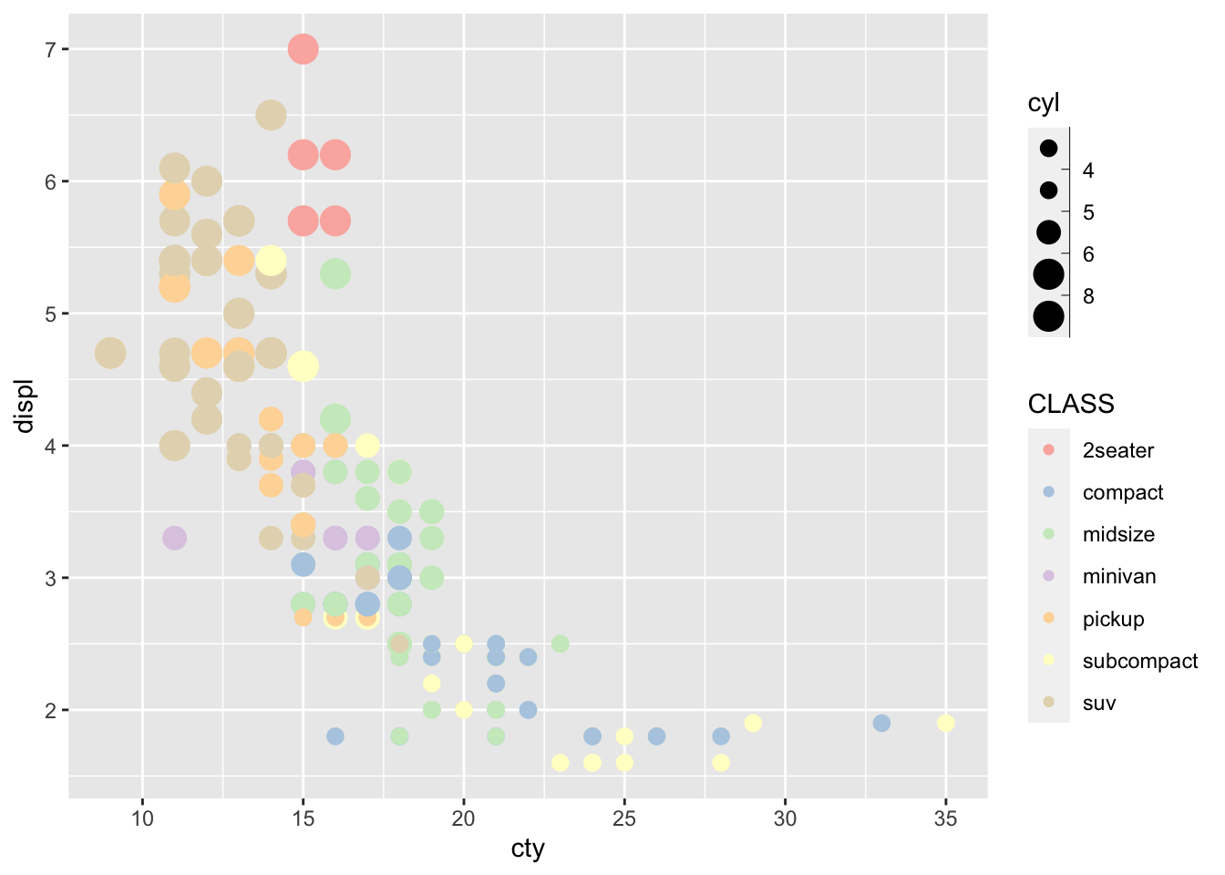
Figure 4: Palette Pastel1
To do this, use the guides(color =" legend ") command, and you get:
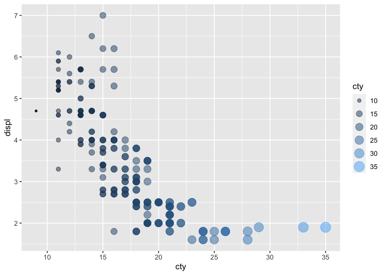
Figure 5: Unified legend
By default, the color palette is a continuous type palette, in which only one color gradient is used. This aspect can be modified in the same way as seen previously.
N.B.: the legends are unified in a single only if they match perfectly in terms of names and number.
