Today, we will focus on the first 3 because those are the ones that requires inputs by us; in fact, the others can be omitted since they already have default values. Here is represented the minimal version of the ggplo2 command:
ggplot(data = <data>) +
  <geom_function>(mapping = aes(<mapping>))
Often, data = and mapping = are implied.
Data
Let’s start with the easyest part, data. In the function above, <data> should be replaced with the dataframe/tibble from which data must be taken. In this post, we will use the standard dataframe mtcars.
Geometries
The second part of the code starts with the geom_function, that is the “geometry” that our graph must assume.
The most used geometries are geom_point() for scatter plot, geom_bar() and geom_col() for barplots, geom_boxplot() for boxplot and so on so forth.
There are lots of geometric functions, and they are strictly related to an other component, statistics. For these reasons, relationships between these two components will be analyzed in a future post.
Below, two examples of different geom_.
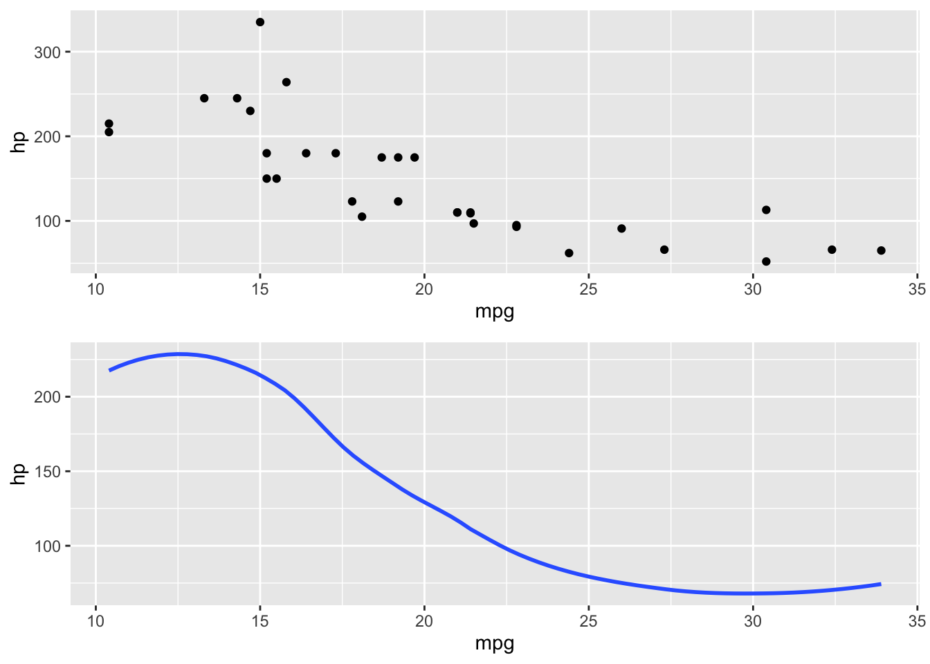
Figure 1: Same data but with different geom_. Above, geom_pont(); below, geom_smooth()
An interesting feature of ggplo2 is the ease with which it is possible to use different geometric functions on the same (or different) data onto the same plot.
All common characteristics must be put inside ggplot(), while geom-specific inputs must be explicated into the corresponding geometric function.
For example, combining the two plots above:
ggplot(mtcars, aes(x = mpg, y = hp)) +
  geom_point() +
  geom_smooth(se = F)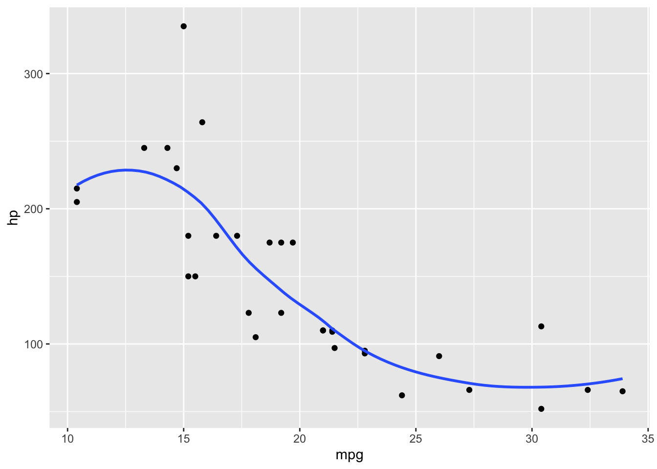
Figure 2: Union of two different geometries in the same plot
Mapping
Thorugh mapping inputs, we tell ggplot2 which variables to plot and other aesthetic parameters, such as color, fill, shape, and others. Let’s see how it works.
ggplot(data = mtcars) +
  geom_point(mapping = aes(x = mpg, y = hp))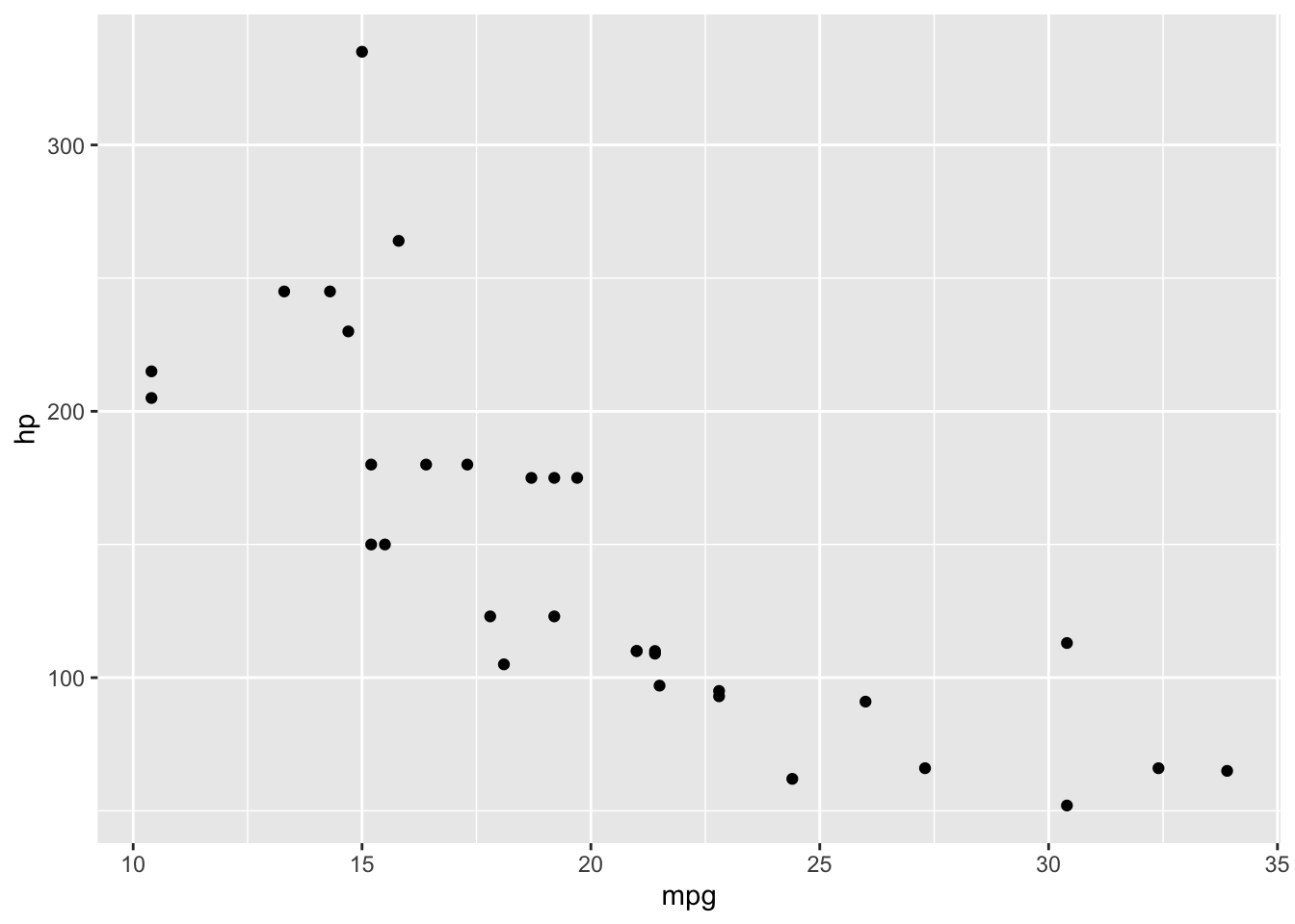
Figure 3: Basic scatter plot
In this example, we told ggplot 2 which variables to plot in x an y axis in the aes() parameter.
Change aesthetics/mapping of all the graph
If we want to change some aesthetics (color, shape, …) to all the data in the graph, we have to specify them outside aes().
For example, here we changed both color and shape of all the points.
ggplot(data = mtcars) +
  geom_point(mapping = aes(x = mpg, y = hp), color = "blue", shape = 3)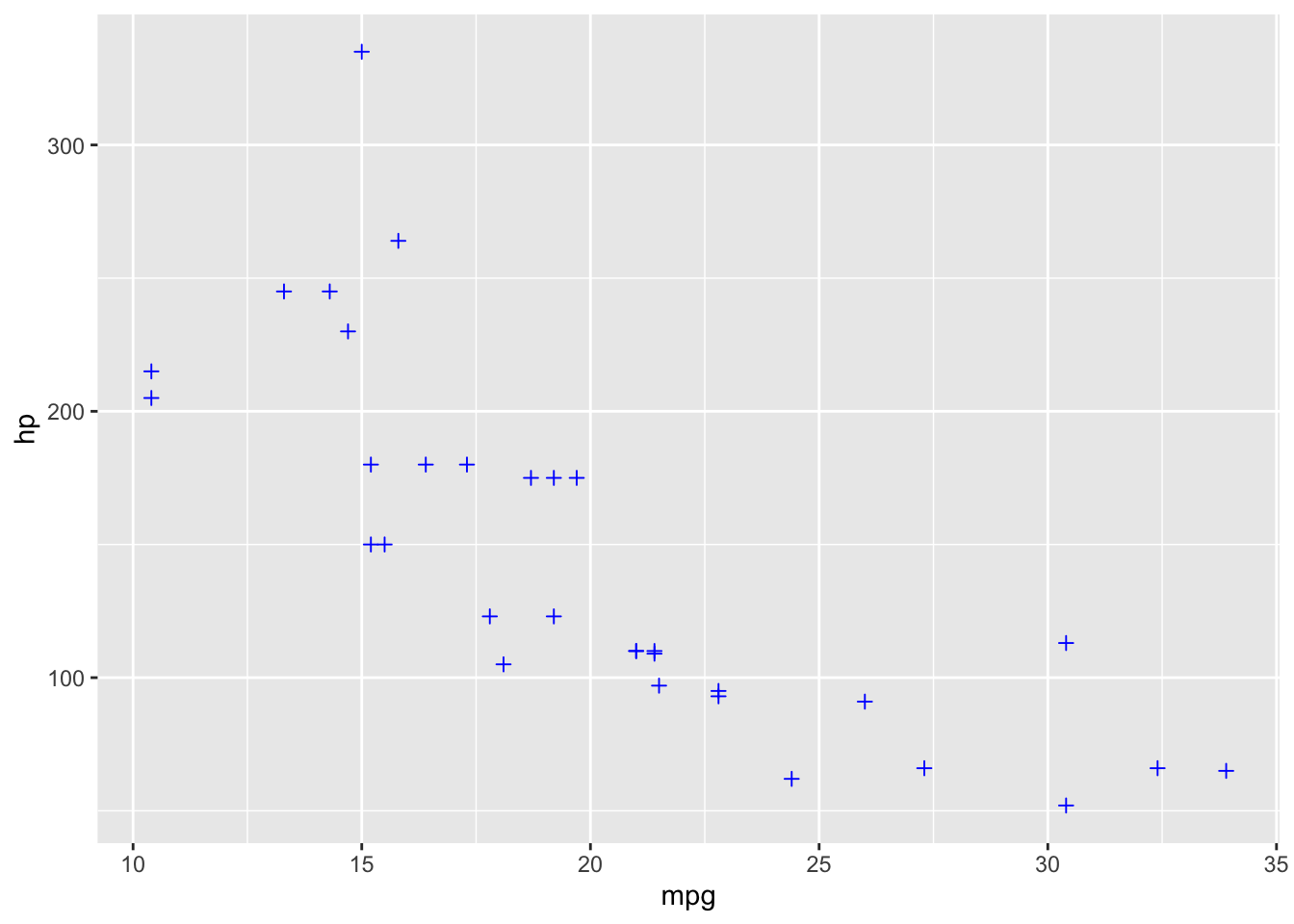
Figure 4: Points color and shape changed in a scatter plot
There a lots of aesthetics and mapping characteristics for each <geom>; for this reason, I will not discuss in details in this post. I suggest to look to the help file of each geometry.
Change aesthetics/mapping based on a third variable.
The same aesthetics/mapping characteristics can be changed based on a third variable or condition.
In this case, they sould be put inside aes(), since not all observation will have the same characteristics in the plot.
Example
We want to discriminate cars that weight less than 3.250 in a scatter plot of mpg and hp.
ggplot(data = mtcars) +
  geom_point(mapping = aes(x = mpg, y = hp, color = wt < 3.25))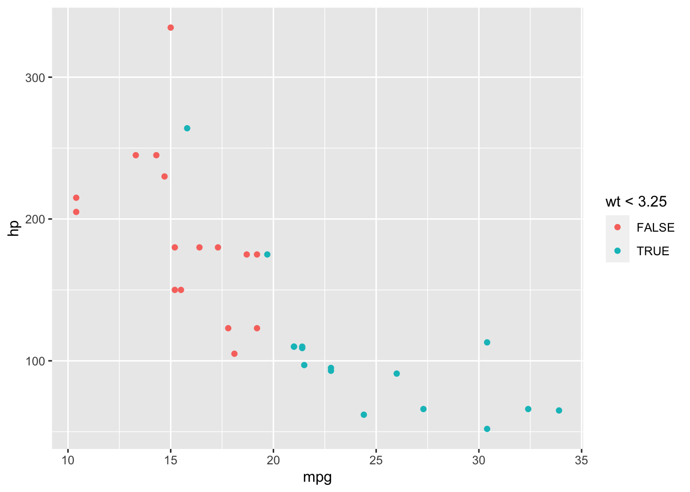
Figure 5: Scatter plot with different colors based upon a condition
As we can see, a legend that helps us understanding color mapping has appeared.
This, and other mappings, can be done using also a categorical (or a continue) variable:
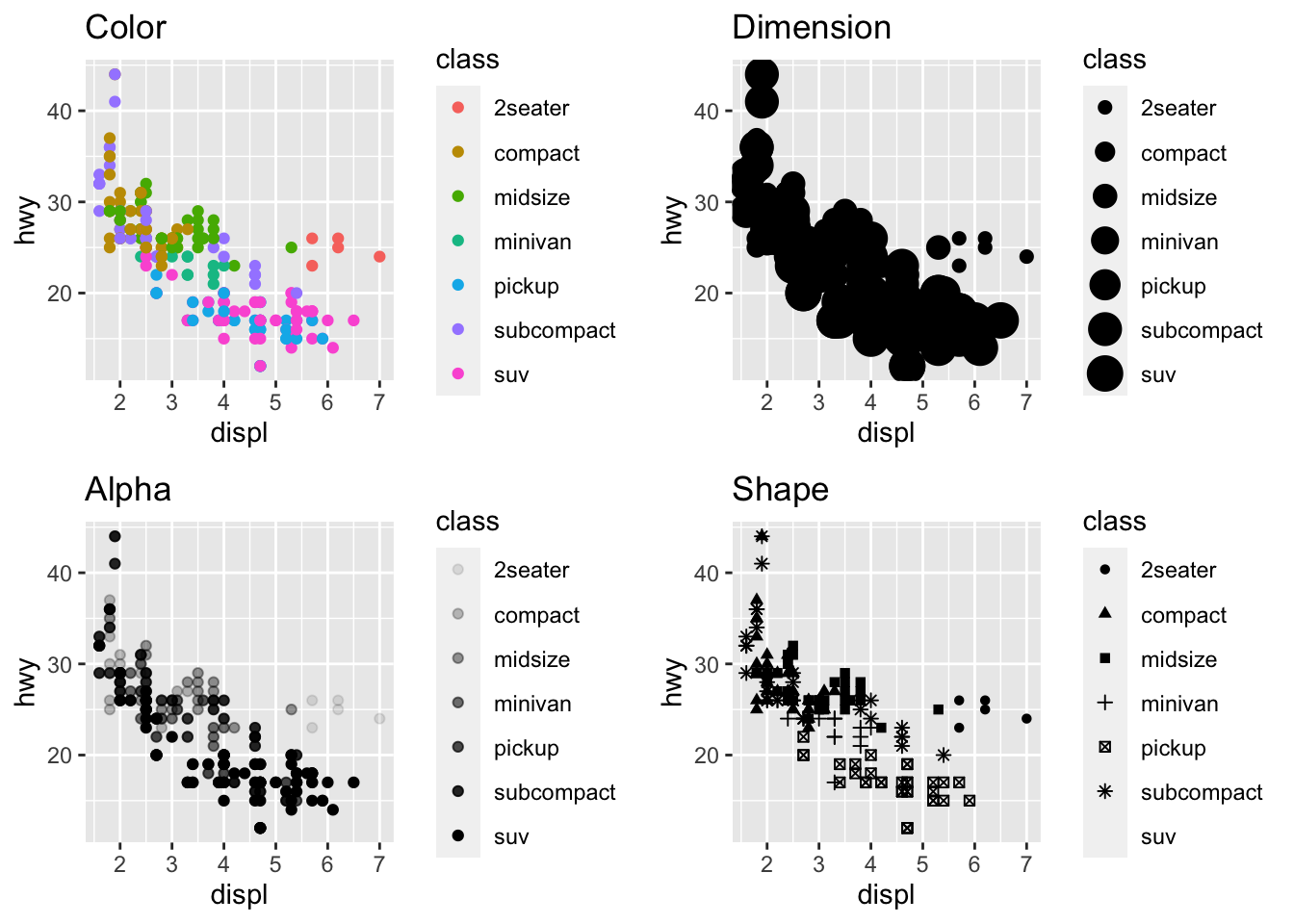
Figure 6: Four examples of how we can discriminate points based on a third variable: color, dimension, alpha and shape
Now, we’ve just seen how to create a simple plot using basic command of ggplot2 package. In further posts, we will analyze the other components with examples and detailed explanations.
