Let’s continue the series on GGPLOT2 analyzing the penultimate component, the coordinates. The functions of this component will allow us to modify some characteristics of the axes, fundamental to finally create a pieplot with GGPLOT2.
Ratio and axes flip
Let’s start by looking at a function that allows us to decide in what ratio the axes must be; in other words, how many units on the y axis does one unit of the x axis correspond to? Let’s see an example right away.
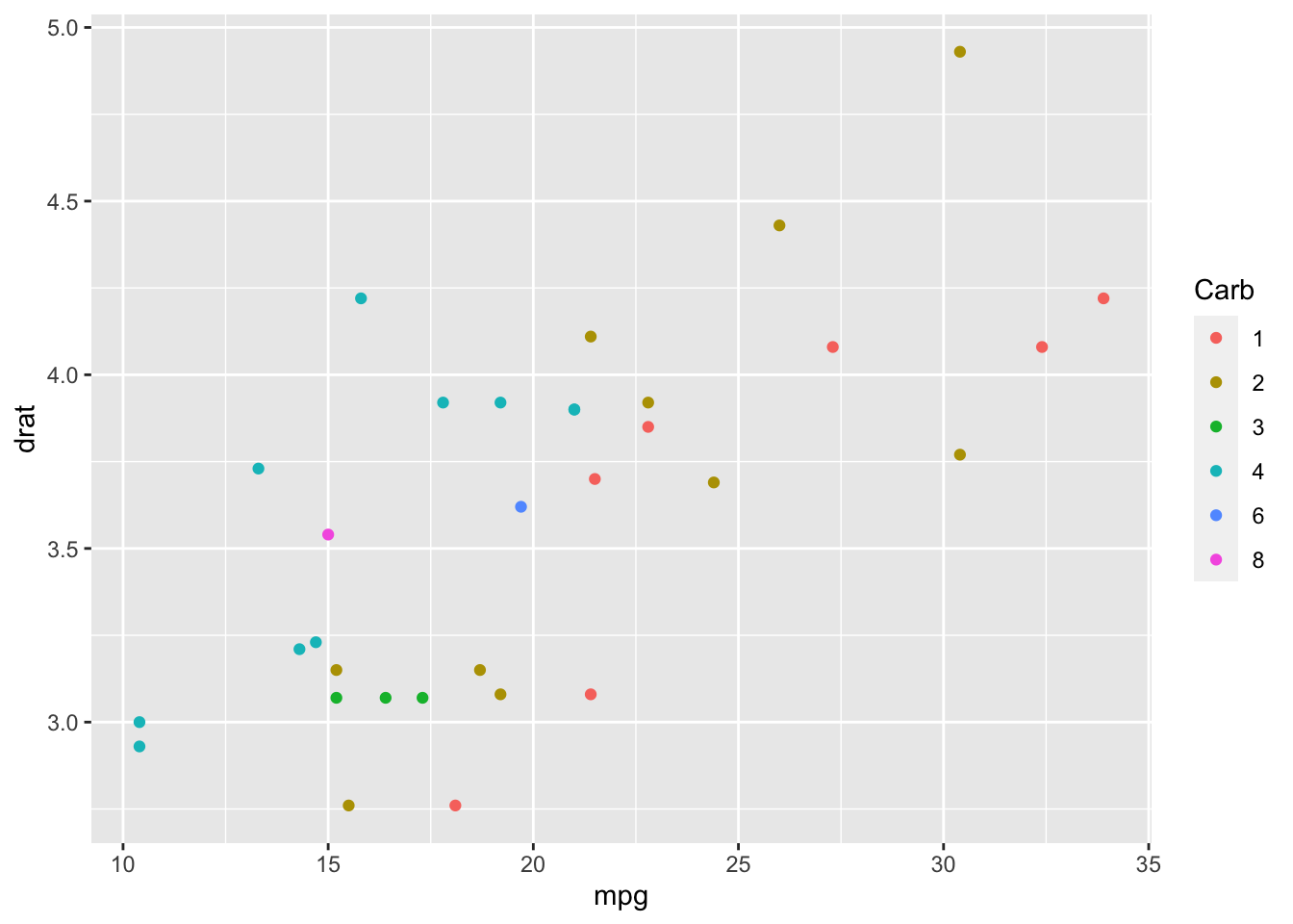
Figure 1: Default graph
By default, ggplot2 tries to make the graph as “beautiful” as possible in terms of axis dimensions, even using different scales for the two axes (as in the figure 1).
Instead, if we want to have the two axes having the same scale, we have to add the command coord_fixed(). The result would be this:
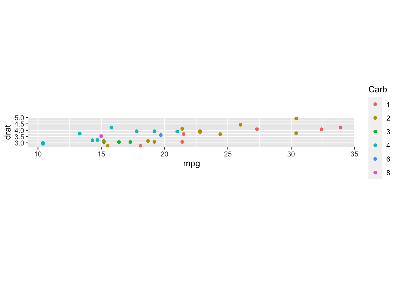
Figure 2: coord_fixed command added to the previous graph
Now the two axes have the same scale, and in fact the y axis is very flattened with respect to the x axis. To change the ratio between the y axis and the x axis, and thus fix the graph, you need to set the ratio input.
Testing with ratio = 10, we get this graph:
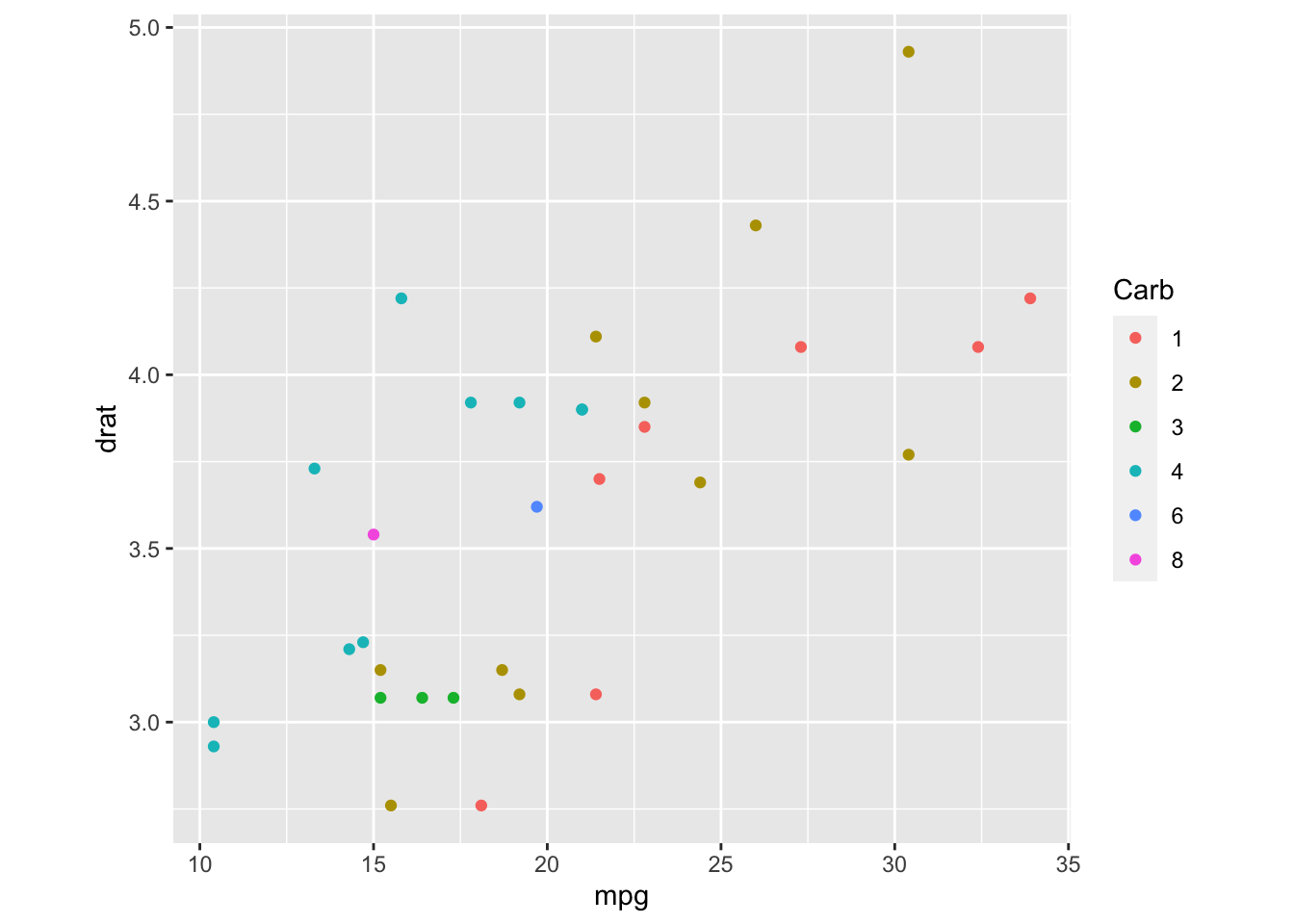
Figure 3: Graph with ratio setted
The graph is clear again. This function may not seem very useful now, but it may turn out as we need to create a graph that is a bit squashed towards the x-axis or the y-axis.
To conclude this mini chapter, I’m going to talk briefly about the coord_flip function which, as you can guess from the name, inverts x-axis and y-axis. This can be useful when you are forced to use geometry or statistics on the x (or y) axis but you would like to have a graph in which the modified values are on the y axis (or viceversa). Just add this little function at the end of the graph command and that’s it.
Zoom and transformations
One thing that the coord_ component allows us to do is to zoom the chart without losing any data (which would happen if we set the axis limits using scales_ in order to zoom in on the chart).
The way to zoom is given by the xlim andylim inputs of each coord_ command; if in the graph you have not chosen to use any coord modifications, remember that the default value is coord_cartesian and that you just need to add that command with the right inputs.
In our case, if we want to zoom the graph in figure 1 to highlight the low values, we should add coord_cartesian(xlim = c(10, 17), ylim = c(2.5, 4)). Here is the result:
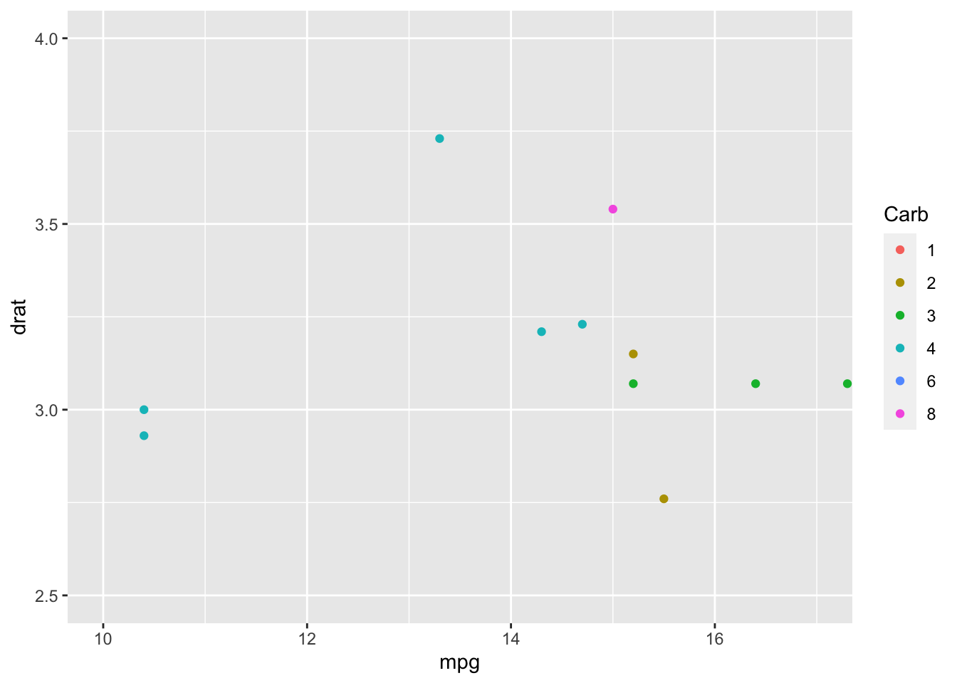
Figure 4: Zoom on the lower part of the graph in figure 1
A very similar argument applies to transformations related to axes, such as the application of a logarithmic scale on them.
The command is coord_trans, and the input in this case is y (or x) = "log".
But why these differences? Scale applies the changes at the beginning, while coord does it later, once the data are already plotted. In fact, by setting restrictive limits with scales, R will say that it has eliminated some data, because that data do not fall within the imposed limits; on the other hand, with coord the data are first plotted, then a zoom is made in the section delimited by the limits set. A similar thing happens for transformations: using coord for it, breaks will have clearer values than those created by scale.
Polar coordinates
Here we are at a very important command for the construction of a pieplot (but not only!):coord_polar.
This command allows us to transform the axes from cartesian to polar. There are various inputs:
Let’s immediately see an example in which the data in y are used as angle values:
ggplot(mtcars) +
  geom_bar(aes(x = factor(cyl)), fill = c("red3", "blue3", "green4")) +
  coord_polar(theta = "y", start = - 1.57) +
  expand_limits(y = 15) +
  xlab("Cyl") +
  scale_y_continuous(breaks = seq(0, 15, 3))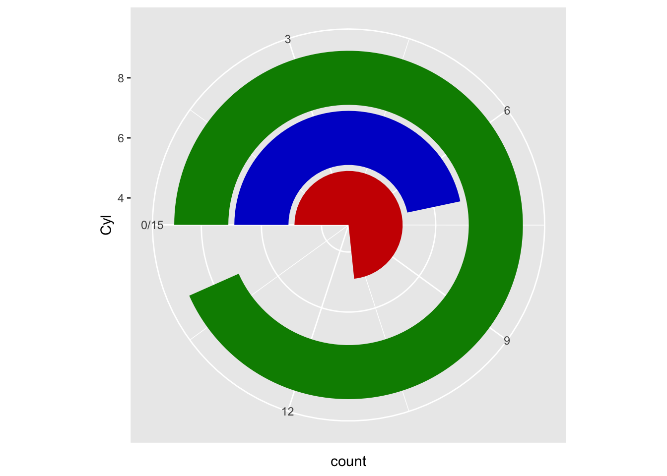
Figure 5: Polar coordinates on a barplot
I added expand_limit because, by default, the limit of the theta angle is equal to the maximum value of the corresponding y axis of the cartesian coordinates, making the one relative to the 8 cylinders become a single circle.
Pieplot
Let’s see now how to create a pieplot on ggplot2. Let’s start from the example in figure 5, this time putting the x axis as the theta angle variable:
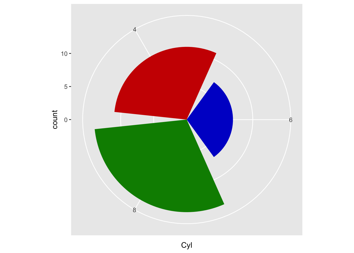
Figure 6: Coord_polar with theta = x-axis
It looks like we’re almost there, which is the right direction for a pieplot. Unfortunately, we’re wrong. To create a pieplot on ggplot2 it is necessary to create a single-column barplot whose values on the y axis represent the various reference values.
# create a df in which are stored the number of cylinder and the corresponding counts

df <- mtcars %>%
  group_by(cyl = factor(cyl)) %>%
  summarise(n = n())


ggplot(df) +
  geom_col(aes(x = 0, y = n, fill = cyl))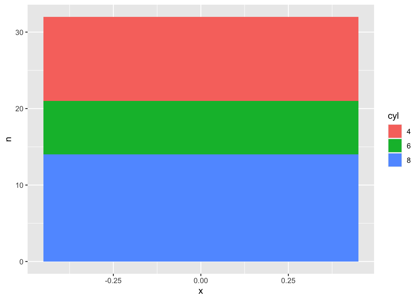
Figure 7: Piplot: first step
Once you get to this point, it might be intuitive to use values in y as values for the theta angle.
ggplot(df) +
  geom_col(aes(x = 0, y = n, fill = cyl)) +
  coord_polar(theta = "y") +
  theme_void()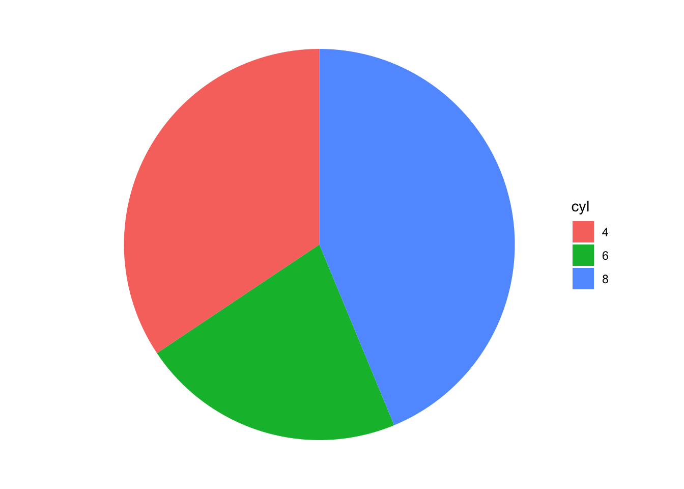
Figure 8: Complete pieplot
Here is our pieplot.
Through geom_text we could add the percentages and have a graph like this:
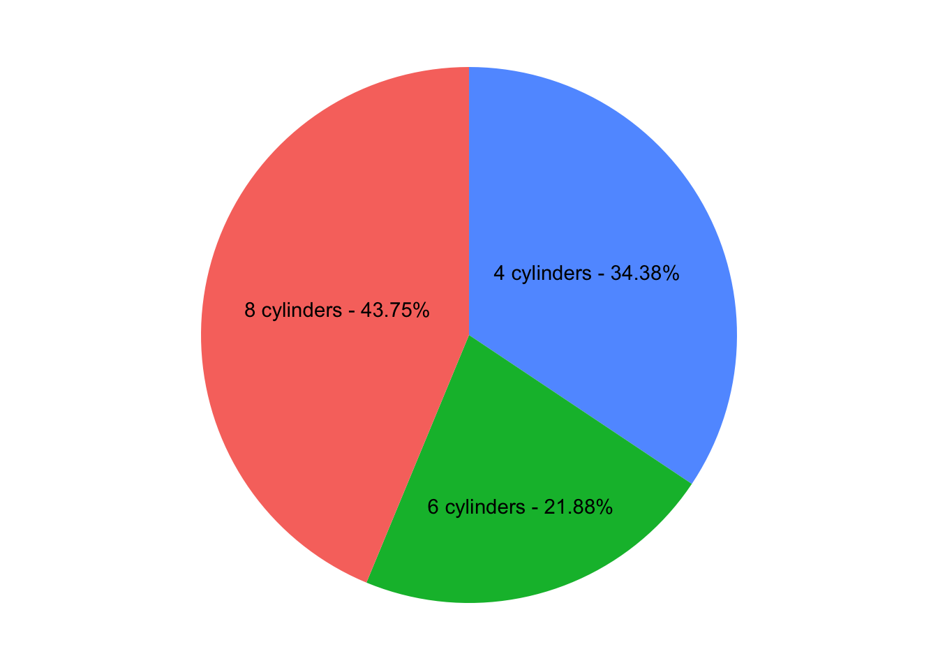
Figure 9: Pieplot with percentages
But, we will see later how to use geom_text well to jot down important information on our charts.
